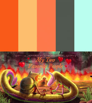
 I do love Adventure Time, Cartoon Network’s bizarro young adult show about a boy adventurer in the Land of Ooo. When I found Dan Toth’s episodic color palettes, I was inspired! What great collections of colors! If you’re hemming and hawing over new colors for your home, let’s try taking our inspiration from nerdaholic teevee.
Imagine it: How much would you enjoy the subtle, subconscious reminder of your favorite fandom in your reupholstered couch or your spray-painted crafty project? GENIUS!
I used Colour Lovers to do the same with a few other nerdy loves: Star Trek, Harry Potter, Firefly, and Doctor Who. Oh, and wait until you see the My Little Pony palette.
Bronies, start your engines!

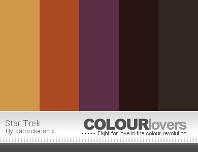
Oh TNG. You are the 90est of Star Treks. Nothing is a true hue. Everything is a little…mustardy. Still, you provide a surprisingly good base for a palette with a desert feel:
 From boring kitchen lamp to faux stained glass geek light
Homie, Sarakenobi turned her kitchen pendant light from boring to BAZINGA! when she used a faux stained glass technique in the nerdiest possible way. And... Read more
Including colors like “tannin” and “fertile earth”, picked from the rich sources of Worf’s hair, the Cardassian’s bodysuit, and that dude’s sweet orange pants, this is truly an earthy palette.
SO. Harry Potter! This is my favorite cover of the series:
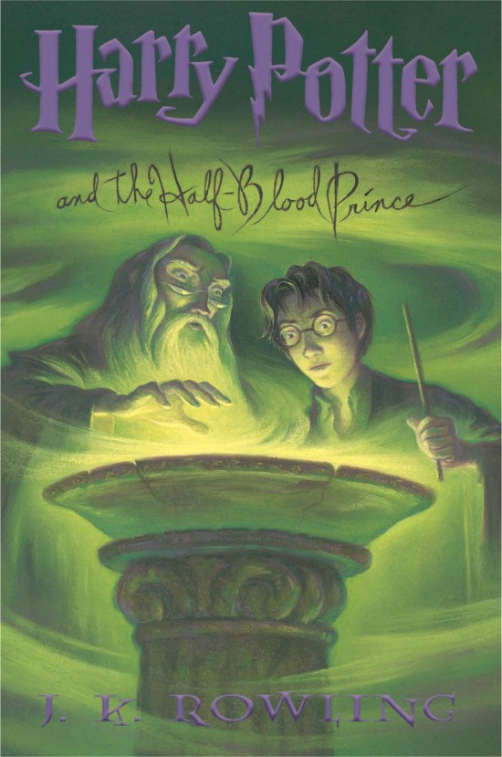
And it is ready for palettizing!
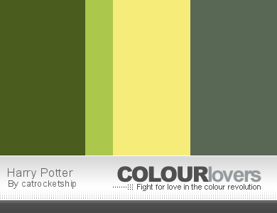
Ooh. Summery. I think this is asking to inspire a bathroom.
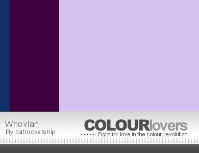
Okay, and I’m not a Whovian (yet!), but Ariel requested a Tardis-y palette. I think this is pretty nice:
Use the light, barely-lavendar as a base, be liberal with the deep purple touches, and less-liberal with the “beyond horizons” blue, and I think you’ve got a remarkable Doctor Who-based colorway.

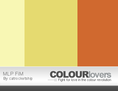
How about some magic from My Little Pony? Specifically, we’ll be focusing on Apple Jack‘s palette, which is totally faithful and strong and could make for a killer livingroom.
AHHHHHHHHH that turned out so well! Way to go, Ponies.
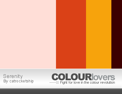
Okay, last one: a little Firefly love:

I think Colour Lovers is going in my toolbox for future fun projects. If you want to make your own palettes, protips: start with googling for screenshots of your property, and pick a good one. If you can’t find something you like, grab a screenshot from Netflix or a DVD — or even search for comic books!
Nerds, start your browsers and show me the palettes you make in the comments!


A doctor who pallet would be mostly tardis blue, a little white, a little bronze, maybe rainbow stripes for tom baker. No idea where the lavendar comes in.
I came here to say this/see if anyone else had said it. Spacey-wacey wormhole lavender, maybe? But the interior has such lovely green and copper tones to choose from.
I was very confused too – but if you click through to see the picture Cat used (which looks like a fan pic), I think the purple is from the light atop the TARDIS mid-dematerialization. Not the most obvious palette, but there would be so many to choose from in Doctor Who! Totally depends on the screenshot you use. Yeah, I’d love to see one based off Tom Baker’s scarf! Might go try that now…
Agreed, lavender is possibly the least-Who color I can think of. The danger of doing a geek fandom-based post is if you don’t know the subject, the geeks will NOT APPROVE. 😉
And Tardis blue and bronze or copper sound like the perfect starting point for a Who-themed palette.
INSPIRED by. 😉 I felt like a SUPER Tardis-blue room would be oppressive.
I had a tardis blue room in my house once and it was kind of awesome. It was a north side room with only a smallish skylight as an outside window. I kind of like really dark colors for rooms that are naturally very dark anyways, because no amount of white/bright paint was going to make that room look light and bright, with it’s window situation. It was an office/study that was mostly used in the evening.
But what about the Mauve Alert? I assumed that’s where the lavender was coming from.
My god, why haven’t I ever done this for my childrenswear line?
Hm, Mal’s palette looks a lot like Applejack’s. I think she would be his favorite pony. Inara would like Rarity. And I’d better stop there, seeing as this is not fanfiction.net. lol
I love you ColourLovers. This post is awesome. Paintchips make my brain go YAY.
Fabulous I love this. I can have a TNG or MLP colour palette!
I can’t help but grin. The My Little Pony palette is pretty much the colours of my living room as is (along with a chocolate brown sofa) and the Harry Potter one is what my toilet is going to be when I redecorate it next week! 🙂
Colour Lovers! I now have a new favorite way to waste time at work. : )
I looooove Colourlovers. I think it is one of my favorite websites to waste time on. :3
Color by COLOURlovers
Did someone say Dr. Who pallets?
Dr. Who: Color by COLOURlovers
Inside the Tardis: Color by COLOURlovers
Gahh, you’re links just go to the sites. Make them work so I can seeeeee!
We just bought a similar dark green to your Harry Potter pallet for out bathroom- and it already has horrible yellow tile the same as the yellow in the sample. I might have to steal the other colors, since they actually look good together!
I think it’s a gross oversight that your harry potter palette omitted the punches of deep indigo/purple that are clearly what ties the color story of the cover together. Just sayin’ 🙂
This is brilliant. My bathroom inspiration is the brothel in Kings Landing from Game of Thrones. I also love cartoon colors. My office is a bright lime green.