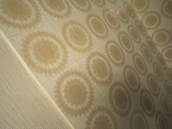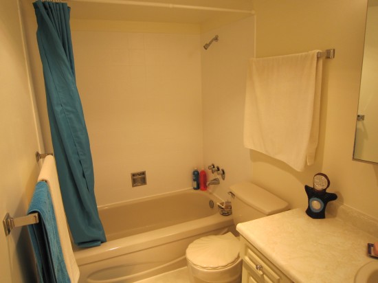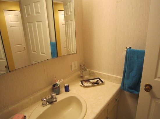
Beige tiles with brown sunflowers? Almond fixtures! Textured wallpaper!?! I hated that every time I sat down to pee I saw how someone has done a shitty job taking out a shower door and just didn’t know how to fix it on my own. I was overwhelmed by the cost and time it takes to renovate a bathroom (new tub? bathroom cabinet? someone who knows how to tile? what kind of taps?) so I waited.

Finally I realized I could do a few small things and transform! For $150 I painted the tiles using a brick and tile primer and water-proof paint, peeled off the wallpaper, scraped off the old silicon caulk and sealant, patched the walls and painted them a neutral off-white called “Popcorn.”
New white silicone caulk brought some challenges 


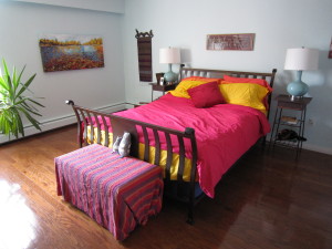
The bedroom is a lovely cool blue, calming but a little dark at times. I found the most incredible painting of the British Columbia interior in fall, with the salmon spawning in the foreground.

I wanted to play with those autumn colours or reds, oranges and yellows and chose new bedding from my favourite sheet store. Now the room is bright and cheery and a pleasure to sleep and snuggle in.


We have sheets from Bed also– I LOVE them. We tend to wash them and put them back on, rather than using another set. LOVE LOVE LOVE that store!
I love the title of this post!! these ideas are really-super-awesome-great!
Holy crap that is the brightest, best bed I have ever seen. Thank you for introducing me to Bed! Now to try and decide what colours to get to spruce up my currently-wintery-snowy bed for summer.
The change to the bathroom is striking! You’ve really succeeded at knocking back all the fixtures so that the eye focuses on the blue towels.
That Popcorn shade of paint is one of my favorites for reading as white while implying diffuse sunshine.