I don’t know that I’ve ever seen a zebra print combined with this super soothing green color… the effect is simultaneously totally relaxing but also a little bit badass. Of course it says something that this room was designed (by Georgia-based interior designer Rachel Greathouse Design) for a teenager, BUT I LOVE IT.
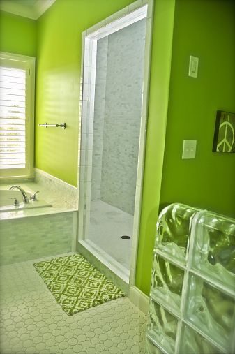
And wait until you see the bathroom…


HOLY SHORT.
That bathroom looks like a modern version of one of those over-the-top 50s/60s magazine homes.
Kinda like the Kermit-green bedroom?
EXACTLYYYYYY. :3
I love green. It’s probably one of my favorite colors. (Can anyone ever pick just one? They’re all pretty awesome. The colors that is.) And I really love that lime green bathroom. However, being the film buff I am, I would feel a little weird living in a green room. In Barton Fink, Natural Born Killers, and Bartleby, the green decor is used to signify emotional badness. The only way I could do the lime green would be to throw in some neon pinks or purples to break it up . . . Then, I’d have a Scooby Doo colored bathroom. Not a bad idea now that I think about it.
I love the bedroom! This green is exactly the colour I want for my own room. I would have never thought to combine it with zebra prints but it actually looks great!
That looks like an amazing way to keep to the colours that I like but also to keep The Flat’s inherent quirkiness going 😀
(edit – when will I learn that I can’t use a “o” as a nose in a smiley when I comment on Offbeat Home?!?)
Teenager??? Why? I would totally LOVE a room like this. I love the green colour and the zebra goes so nice with it… lovely relaxing bedroom. I would never have guessed that this was done for a kid. Or maybe I’m still a kid 🙂
I hope that if I ever have kids, they will be GREEN AND ZEBRA cool.
This was such a fun project to do:))